We believe an inclusive website is part of building an inclusive world. That’s why our site was co-designed with people with disability, tested by people with specific digital access needs, and created with accessible colours, design, and navigation. Our goal is simple — for everyone to be able to find and use the information they need, without barriers.
Accessibility at JFA Purple Orange
We want everyone to be able to use our website easily. That’s why it was co-designed with people with disability, tested by people with specific digital access needs, and built to meet recognised accessibility standards.
How we make our site accessible
We aim to meet WCAG 2.1 Level AA standards, which make content more accessible for people with disability and easier for everyone to use.
Our site includes:
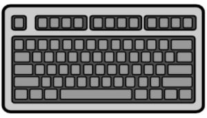
- Keyboard navigation – move through pages without a mouse.
- Screen reader compatibility – works with assistive technology.
- Clear visual contrast – text and backgrounds are easy to read.
- Accessible colours and design – choices made to support visibility and comprehension.
- Alternative text – descriptions for all meaningful images.
- Accessible forms – with clear labels and instructions.
- Responsive design – works on all devices and screen sizes.
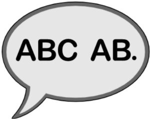
Easy English
We provide Easy English versions of key pages, using simple words, short sentences, and images. Look for the “Easy English” link at the top of the page. More pages are being added over time.
Translation
Our site can be translated into many commonly used languages. Use the translation menu at the top of the page to select your preferred language.
Accessibility menu
Our website includes the UserWay accessibility widget, a tool designed to make browsing easier for everyone. You can open the widget anytime by selecting the accessibility menu button in the bottom-right corner of the screen.
The widget offers simple, customisable options you can switch on or off with a toggle, so the site works best for you. The features include:
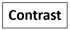
- Contrast — invert colours, dark contrast, and light contrast options.
- Highlight links — to make them easier to spot.
- Bigger text — increase font size for easier reading.
- Text spacing — add more space between words and lines.
- Pause animations — stop moving elements on the page.
- Hide images — remove visuals if they are distracting.
- Dyslexia friendly — switch to a dyslexia-friendly font.
- Cursor — switch to a big cursor, or use a reading mask or reading guide for focus.
- Tooltips — show small pop-up hints.
- Line height — adjust line height to 1.5x, 1.75x, or 2x
- Text align — adjust to left align, right align, centre align, or justify.
Feedback
We welcome your feedback to help us improve. Please contact us to let us know your thoughts.