We’ve launched our new brand and website — co-designed with people with disability to be inclusive, accessible, and easy to use.
The new purpleorange.org.au brings together everything we do: our advocacy, resources, stories, and projects, all in one welcoming and easy-to-navigate space. It’s designed to make it easier for people with disability, their families, and supporters to find information, share ideas, and connect with us.
Why we refreshed our brand
Our refreshed brand reflects who we are today and the community we work alongside. We’ve kept the spirit of the Purple Orange — created to make people pause and look closer — and introduced a circle as our core symbol. The circle represents inclusion, equity, and belonging: it has no beginning or end.
It reflects our belief that everyone deserves a place where they are welcomed and valued, and that the journey toward full inclusion is ongoing.
Designed with accessibility and authenticity in mind
Our new website was co-designed with people with disability to ensure it’s accessible and user-friendly for everyone. It features clear navigation, accessible fonts, plain language, and compatibility with screen readers and other assistive technologies. Read more about our website accessibility features.
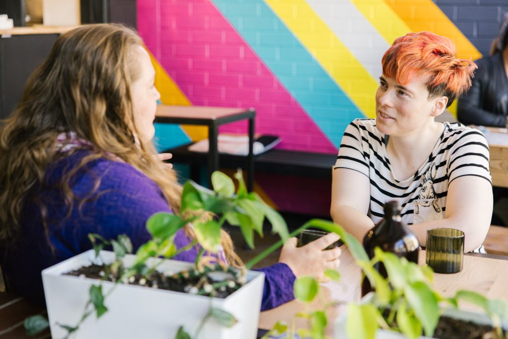
Most of the photography on the site comes from a recent photo shoot featuring people with and without disability. We wanted the images to show real people in real settings — in homes, workplaces, and community spaces — to authentically represent the diversity and strength of the disability community.
This new website is part of our ongoing commitment to making sure people with disability can access the same opportunities, resources, and representation as everyone else.
We’d love your feedback
Take a look around, explore what’s new, and let us know what you think. Your feedback helps us continue improving and making sure our website truly works for everyone.

